Tuesday, September 26, 2017

Loading the Solver add-in for Excel so that you can perform graphical analysis of charts


For starters, see here. For the quick start version, see here:
  1. File => Options => Add-ins
  2. Check "Active Application Add-ins" first to see if it's already loaded. If "Solver Add-in" is not in there, search under "Inactive Application Add-ins"
  3. Near the bottom of the window, under the "Manage" drop-down, select "Excel Add-ins" and hit the Go button.
  4. Ensure the "Solver Add-in" button is checked off, then click the "Ok" button and save all the way back to your workbook.

Monday, September 25, 2017

How to include multiple Earned Value charts on the same graph


  1. Ensure that you have your Earned Value data series all in the same workbook
  2. Ensure that the date series' for your Earned Value series are actually formatted as dates
  3. Start by rendering the first Earned Value series as a SCATTER PLOT with straight lines
  4. Edit the chart data to add subsequent Earned Value series until they're all on the same chart

TODO: Update this post to include screen shots.

How to quickly graph a comparison of projects with PDEx in Excel 2016


  1. Select your projects in Windows Explorer, right click => Open 
  2. Once all of your projects are loaded into an instance of Microsoft Project with PDEx installed, go to the "Project Design" tab and click on "Compare": 
  3. In the window that opens up to compare your Projects, go to the Summary tab:
  4. Click somewhere in the table of values and press Ctrl+A to select all of the cells: 
  5. Press Ctrl+C to copy the contents of the table to the clipboard.
  6. Open a new Excel workbook, and on a blank worksheet, go to cell A1: 
  7. Press Ctrl+V to paste the table of values from MS Project into Excel: 
  8. Select a SINGLE column of data across projects that you'd like to graph and click on the quick action icon in the bottom right, e.g. Total Cost:
  9. In the Quick Action dialog that appears, select the "Charts" tab: 
  10. Click on the "Scatter" chart type to generate a Scatter plot of the data points. This will generate the series on the Y-axis, with default serial numbers as the X-axis:
  11. Right click on the chart and select "Edit Data" to edit the data series:
  12. In the "Select Data Source" dialog that appears, select the created data series and click on the "Edit" button to edit it: 
  13. In the "Edit Series" dialog that appears, select the cell that's to be used for the series name, and the range of cells that are to be used as the X-axis for the data series. Then click Ok to save the changes, and OK again to close the Series editor: 
  14. Once back in the main Excel window, with the Chart still in Edit mode, go to the top right of the data area and hover over the corner until you have an "Expand" mouse cursor: 
  15. Click on the corner anchor and drag to the right to include extra data series extracted from the neighbouring columns: 
  16. Now that you've got all of the series you want to include on the graph (Cost in our case), you'll need to pare down the X-axis to have the series' fill out the chart. Right-click on the X-axis and select Format Axis: 
  17. In the "Format Axis" pane that appears on the right side of the Excel window, set appropriate X-axis bounds: 
  18. In order to match the graphs we see in the Project Design manual which include data labels that have the names of the corresponding project variants, start by right-clicking on one of the data series and then clicking on "Add Data Labels": 
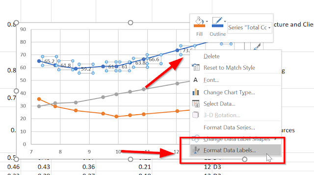
  19. This will add default data labels with the Y-values of the data points to the series. However, we want to use the names of the corresponding projects, so we have more work to do. Right-click on one of the data labels and click on "Format Data Labels ...": 
  20. In the "Format Data Labels" pane that appears on the right side of the Excel window, select "Value from Cells". This will cause the "Data Label Range" dialog to appear: 
  21. Click on the textbox in the "Data Label Range", then select the cells under the "Project" column, EXCLUDING THE "PROJECT" HEADER. Then click OK: 
  22. You'll now have your chart for your project comparison data, with (at least one) series set up to look just like the Project Design manual: 
Happy charting!

Saturday, September 16, 2017

The Tech Lead's New Project Checklist, propagated

A while ago a virtual colleague recommended this article on a forum:

https://insimpleterms.blog/2017/08/07/the-tech-leads-new-project-checklist/

It's a checklist for all the items a Technical Lead  should enumerate on a New Project. It's a good read if you're in (or could potentially be in) the position of leading a team in a technical project.

Wednesday, September 06, 2017

Useful PowerPoint Shit, Part 2 - Cloning objects quickly

I don't like using the mouse, but if I have to I will. Here's some tips for quickly cloning items in PowerPoint:


  1. Duplicating a shape - Ctrl+C, Ctrl+V OR Ctrl+D (while not in text edit mode) OR Ctrl+Mouse drag
  2. Duplicating a slide - Ctrl+Shift+D

Useful PowerPoint Shit, Part 1 - Copying and Pasting Shape Attributes

I love using hotkeys to execute my tasks because they reduce the number of times my hand has to leave the keyboard and go for the mouse, and consequently accelerate the task at hand. I've recently had cause to start using PowerPoint a lot more as my role at the company where I work has shifted and my job description has changed somewhat.

That said, I've discovered this useful gem for copying attributes between shapes so that I don't have to use the mouse and navigate menus to clone items or otherwise search for paste options:

Copy the attributes of a shape
  1. Select the shape with the attributes that you want to copy. ...
  2. Press CTRL+SHIFT+C to copy the shape attributes.
  3. Press the TAB key or SHIFT+TAB to select the shape or object that you want to copy the attributes to.
  4. Press CTRL+SHIFT+V.