- Select your projects in Windows Explorer, right click => Open
- Once all of your projects are loaded into an instance of Microsoft Project with PDEx installed, go to the "Project Design" tab and click on "Compare":

- In the window that opens up to compare your Projects, go to the Summary tab:

- Click somewhere in the table of values and press Ctrl+A to select all of the cells:

- Press Ctrl+C to copy the contents of the table to the clipboard.
- Open a new Excel workbook, and on a blank worksheet, go to cell A1:

- Press Ctrl+V to paste the table of values from MS Project into Excel:

- Select a SINGLE column of data across projects that you'd like to graph and click on the quick action icon in the bottom right, e.g. Total Cost:

- In the Quick Action dialog that appears, select the "Charts" tab:

- Click on the "Scatter" chart type to generate a Scatter plot of the data points. This will generate the series on the Y-axis, with default serial numbers as the X-axis:

- Right click on the chart and select "Edit Data" to edit the data series:

- In the "Select Data Source" dialog that appears, select the created data series and click on the "Edit" button to edit it:

- In the "Edit Series" dialog that appears, select the cell that's to be used for the series name, and the range of cells that are to be used as the X-axis for the data series. Then click Ok to save the changes, and OK again to close the Series editor:

- Once back in the main Excel window, with the Chart still in Edit mode, go to the top right of the data area and hover over the corner until you have an "Expand" mouse cursor:

- Click on the corner anchor and drag to the right to include extra data series extracted from the neighbouring columns:

- Now that you've got all of the series you want to include on the graph (Cost in our case), you'll need to pare down the X-axis to have the series' fill out the chart. Right-click on the X-axis and select Format Axis:

- In the "Format Axis" pane that appears on the right side of the Excel window, set appropriate X-axis bounds:

- In order to match the graphs we see in the Project Design manual which include data labels that have the names of the corresponding project variants, start by right-clicking on one of the data series and then clicking on "Add Data Labels":

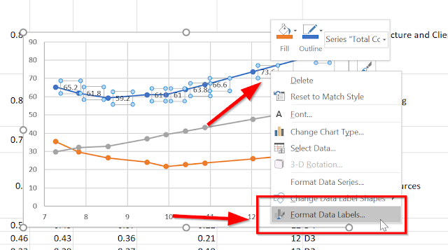
- This will add default data labels with the Y-values of the data points to the series. However, we want to use the names of the corresponding projects, so we have more work to do. Right-click on one of the data labels and click on "Format Data Labels ...":
- In the "Format Data Labels" pane that appears on the right side of the Excel window, select "Value from Cells". This will cause the "Data Label Range" dialog to appear:

- Click on the textbox in the "Data Label Range", then select the cells under the "Project" column, EXCLUDING THE "PROJECT" HEADER. Then click OK:

- You'll now have your chart for your project comparison data, with (at least one) series set up to look just like the Project Design manual:


Happy charting!
No comments:
Post a Comment